Archive for February 2023
Creating time series plots of toxin monitoring data

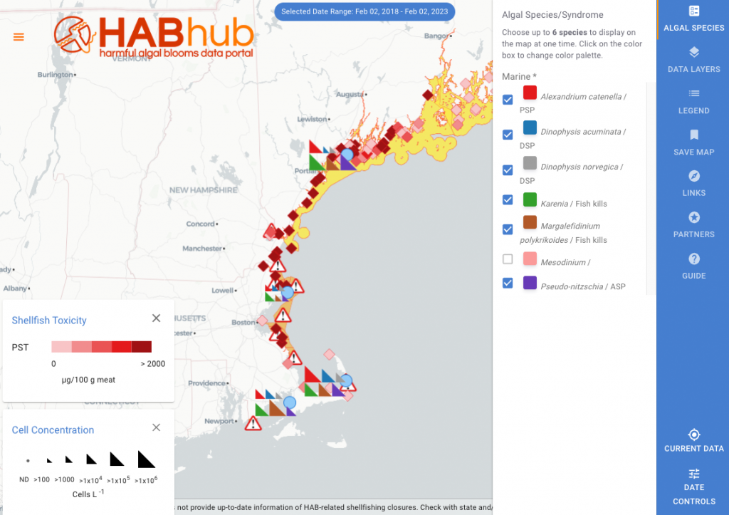
One useful feature of the HABHub is that it can produce downloadable graphs featuring specific data as configured by the user. To explore this capability, visit the HABhub, and select either the “Cell Concentration” or “Shellfish Toxicity” data layers from the right-hand menu, and configure the date range using the “Date Controls” on the bottom…
Read MoreLearn about new HABhub features and capabilities!
Visit the HABhub blog to learn about latest updates to the HABhub, and how these tools and features promote data access and analysis!
Read MoreSaving your Map
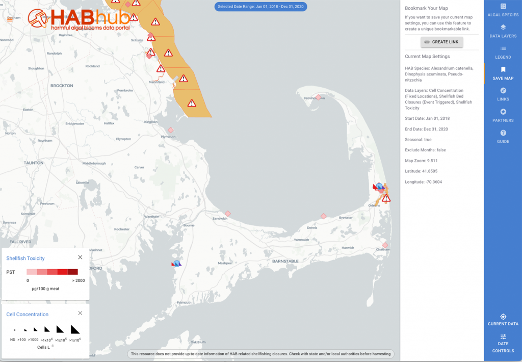
Saving your Map The “Save Map” tool is located in the right-hand menu bar, and allows users to save a particular map configuration (e.g., data layers selection, geographic zoom, and timeframe). By clicking on the icon, users are provided a description of the current map settings, including visible species, active data layers, and both time…
Read MoreCustomizing your color palette
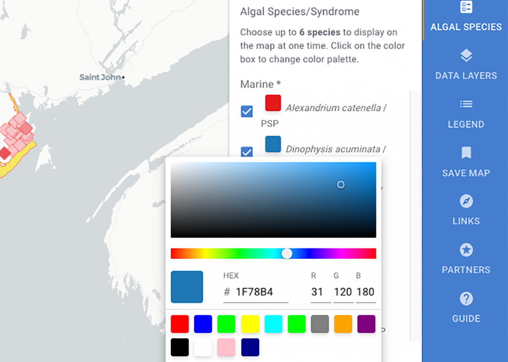
One exciting feature on the HABhub data layer interface is the color selection tool. In the “Algal Species” section of the right-hand menu, users can select up to six species to view on the map, and by clicking on the colored square next to the species name, can also change the display color of each…
Read More