Create IFCB Data Graphs
Another excellent feature on the HABHub is the capability to make graphs specifically based on IFCB data, and to see real photos of the algae taken on a date and time. The Imaging FlowCytobot is one of the strongest tools in HAB monitoring efforts, photographing and identifying every cell in the water samples it collects, and sharing that data to the research teams at WHOI. The HABHub has integrated that data- and the photos!
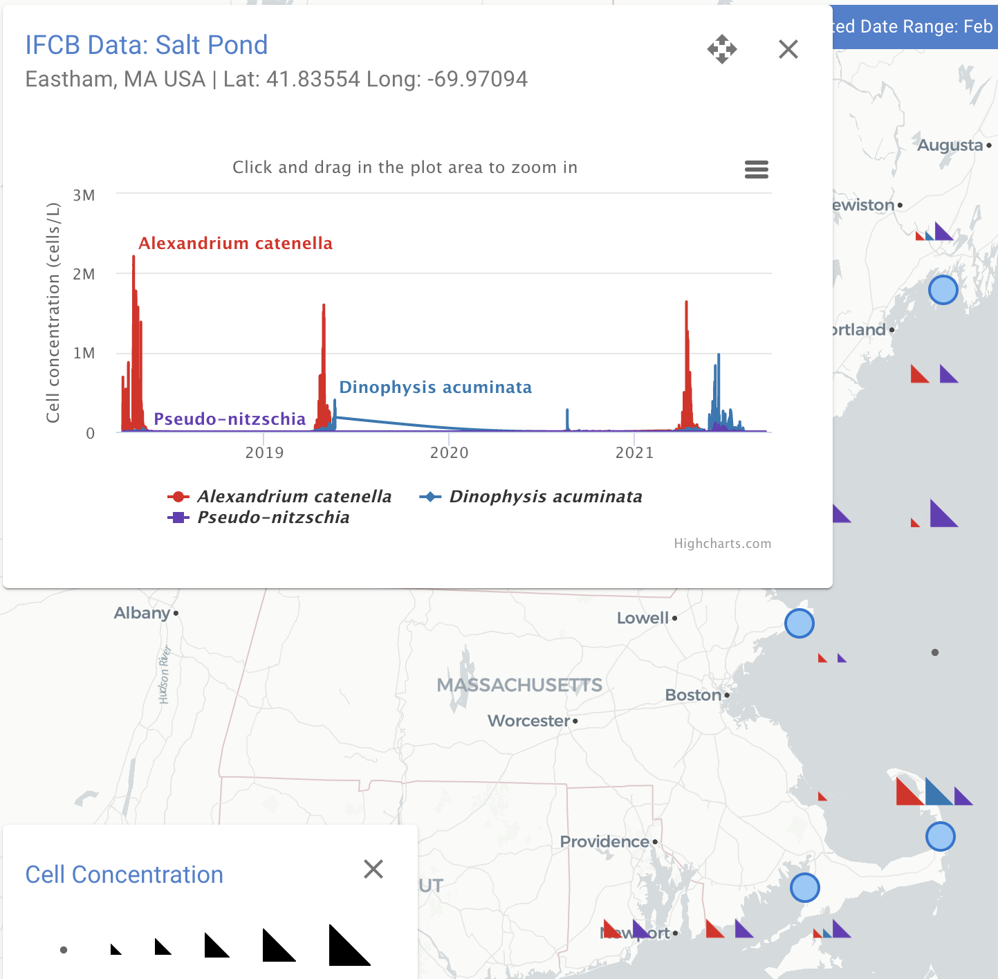
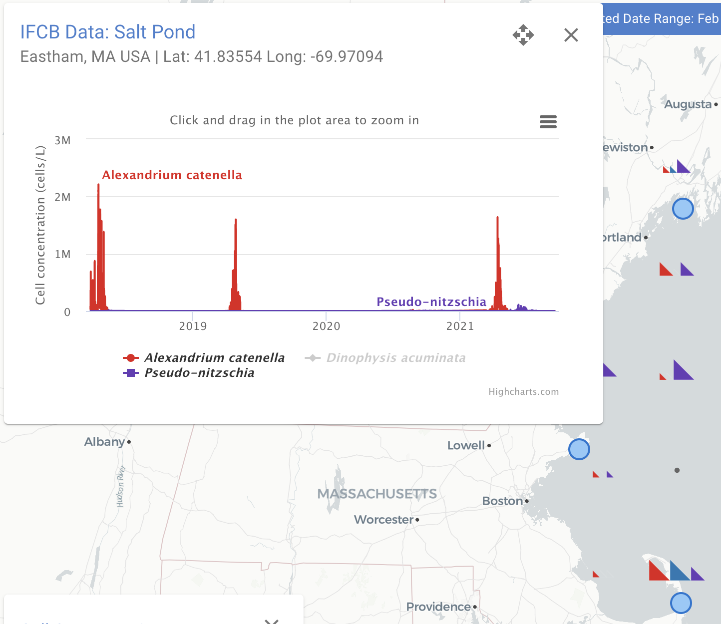
Begin by entering the HABHub, and selecting the “Cell Concentration” data layer (both the “Fixed Locations” and “Spatial Grid” will work). The blue circles on the map represent long-term IFCB sampling locations, and here is the graph generated by selecting the Salt Pond IFCB on the Outer Cape. Users can toggle the three species represented on the graph by clicking on the species name in the key below the graph.


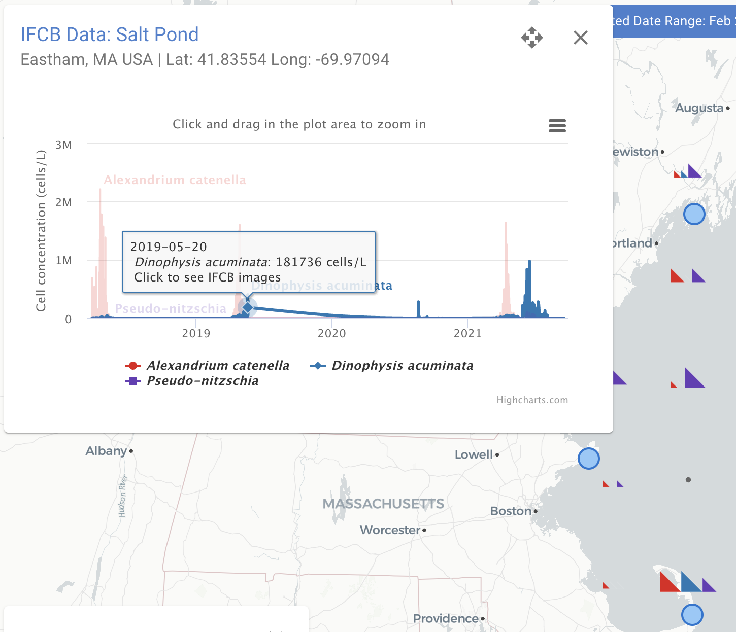
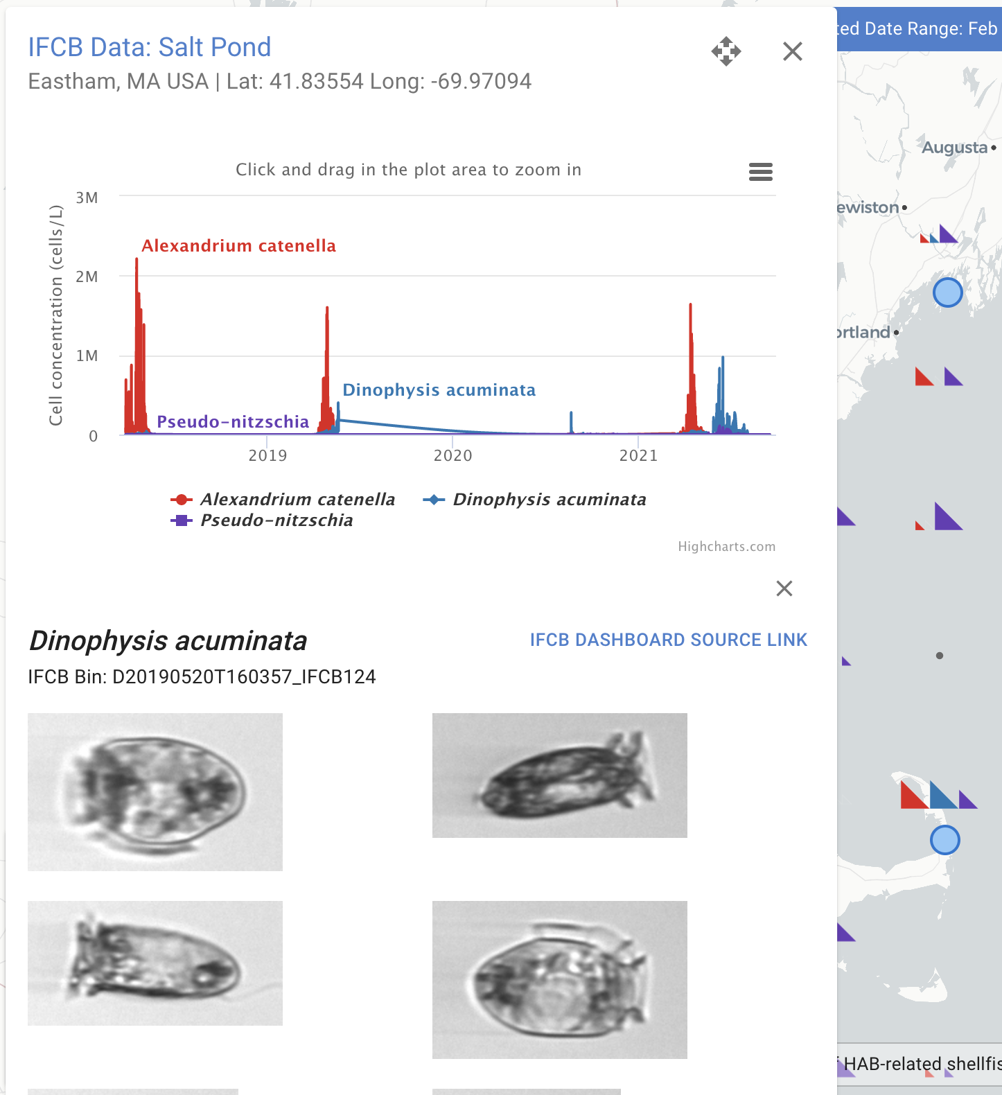
To access the IFCB photos, hover the cursor any point on the graph and click. Hovering produces a dialog box with the date, species, and cell concentration information, and clicking opens up the repository of photos taken of the selected species on that day. Scroll down and see the variety of shapes and sizes!


